Ok, this is a very important topic and one that demands an answer! (Ok, not really… I’m just looking for something fun to discuss)
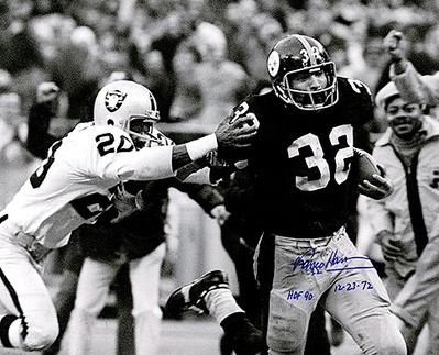
Why on earth are they sticking with this garbage font for their jersey numbers? They changed to this look in 1997. WTF? It’s pushing 3 decades now, and they STILL look like shit.
In my experience, (and I’ve asked this question countless times), almost everyone loves the block number uniforms. The current look either brings a negative comment or at the best, it brings indifference.
IMO, the block numbers are the ones that give almost every NFL uniform their cleanest, best look. The only teams that don’t have to have block numbers are the Bears, Cowboys and Colts (and the Cowboys and Colts have just a variation on the block). Other than that, most teams that try to find a unique font make their uniforms look like a car from NASCAR.
So what is the opinion here? If given the choice, would you keep the current number font or go back to the block numbers of the Noll era?
Serious topic - the uniforms…. Specifically block numbers
-
CoolShades

- Posts: 387
- Joined: Mon Dec 11, 2023 3:45 am
Serious topic - the uniforms…. Specifically block numbers
Mike Tomlin and NHALS - The embodiment of the soft bigotry of lowered expectations.
-
Dan Smith--BYU

- Posts: 2146
- Joined: Mon Dec 09, 2019 12:33 am
"Why on earth are they sticking with this garbage font for their jersey numbers? They changed to this look in 1997. WTF? It’s pushing 3 decades now, and they STILL look like shit.
In my experience, (and I’ve asked this question countless times), almost everyone loves the block number uniforms. The current look either brings a negative comment or at the best, it brings indifference."
Preach on brother, I do not know anyone who likes the lame 90s font more than the classic 70s block font. And everyone loves it when they bring back the classic (but not the 30s bees or the 60s Batman).
But I guess some people like Chumbawumba better than the Allman Bros.
Speaking of classic unis, bring back the 60s early 70s mustard yellow Clemente Pirates uniforms. These city color splash PGH unis look like they belong in a beer league.
The surest way to corrupt a youth is to instruct him to hold in higher esteem those who think alike than those who think differently.
Nietzsche
Nietzsche
-
bradshaw2ben
- Site Admin
- Posts: 29584
- Joined: Sat Sep 21, 2019 2:51 am
- Location: Los Angeles
- Contact:
I hated them when it first changed in -997… but I have to admit I didn’t care for going back to the block numbers, mostly because pads are so much smaller and low profile now. The block numbers kind of overwhelm the jersey IMO
-
Louis Lipps Service
- Posts: 3144
- Joined: Tue Sep 24, 2019 4:33 pm
Hey, hey, hey.
Keep Chumbawumba out of yer damn mouth!
Keep Chumbawumba out of yer damn mouth!

I went to the Packers game last year when they wore the block numbers. I thought they looked great.bradshaw2ben wrote: ↑Mon Jun 24, 2024 12:01 amI hated them when it first changed in -997… but I have to admit I didn’t care for going back to the block numbers, mostly because pads are so much smaller and low profile now. The block numbers kind of overwhelm the jersey IMO
#NoMoTomlin
#BecauseTomlin
#FireTomlin
#Obviously
#BecauseTomlin
#FireTomlin
#Obviously
-
Dan Smith--BYU
- Posts: 2146
- Joined: Mon Dec 09, 2019 12:33 am
https://www.reddit.com/r/steelers/comme ... ly_please/
Reddit agrees.
It's not sentimentality either. The 79 Pirates unis were hideous.
Reddit agrees.
It's not sentimentality either. The 79 Pirates unis were hideous.
The surest way to corrupt a youth is to instruct him to hold in higher esteem those who think alike than those who think differently.
Nietzsche
Nietzsche

Everyone I know say go back to the block.
-
Thrillsseeker
- Posts: 5402
- Joined: Sun Sep 22, 2019 11:42 pm
I wouldn’t mind block #’s, but I go to bed every night and not one time has this crossed my mind.
-
Steeldrama
- Posts: 2362
- Joined: Tue Sep 24, 2019 6:44 pm
I admittedly have a renewed interest in uniforms mostly because I have a teenager who keeps me young-ish
College uniforms much cooler to me
Schools don’t need to go all Oregon and have a dozen choices but I like variety.
The Chargers immediately come to mind in the NFL as far as embracing variety and stylistic alternatives
Steelers too traditional for me.
I’d like to see Nike have the creative freedom to design some more modern Steelers alternatives including a new helmet kinda like the Ravens new alternative purple helmet
Block letters are fine but we can do better
Nick Markakis on Astros: "Every guy over there needs a beating."

I greatly prefer the block numbers
but I think AR2 views the italicized numbers as his stamp and identifier of his time controlling the ship.
So, I assume we are stuck with them until he leaves
but I think AR2 views the italicized numbers as his stamp and identifier of his time controlling the ship.
So, I assume we are stuck with them until he leaves

-
W&M_Steeler
- Posts: 1580
- Joined: Tue Oct 08, 2019 2:55 am
Same. If anything, I somewhat prefer the current look to the old block numbers. I think this board skews old- I am in my 40s and wasn't even alive for the 70s teams. You'd have to be in your early 50s at the youngest to have a living memory of watching the 70s dynasty. Consequently, I don't think block numbers are anything most fans under 50 really think about. I like the look, and I remember they still had it for Super Bowl XXX, but I don't have a strong attachment to it. When I see it, I think Iowa (ironic, I know).Thrillsseeker wrote: ↑Mon Jun 24, 2024 12:37 pmI wouldn’t mind block #’s, but I go to bed every night and not one time has this crossed my mind.
The current look is the look of the 2000s team that won 2 Super Bowls and went to another. I think of Ben, Polamalu, Harrison, Ward, Faneca, Bettis, Porter, Keisel, etc when I think of the current look. They're more my team than the 70s greats, who I appreciate but who were before my time.
I wouldn't oppose going back to block numbers, but I don't feel that they necessarily should or that the block look is superior to the current look. So long as they don't switch to those terrible alarm clock style numbers Tampa had for a few years, I'm fine either way.
-
stairway 2 seven
- Posts: 322
- Joined: Sun Sep 22, 2019 2:05 pm
I will never own one of the current style jerseys. The font looks like something Disney would design.
Going back to the block numbers or maybe a modern version of them is what they should do.
Going back to the block numbers or maybe a modern version of them is what they should do.
-
Louis Lipps Service
- Posts: 3144
- Joined: Tue Sep 24, 2019 4:33 pm
Prefer the block numbers, but I don't find the current ones offensive, by any means. It's honestly a pretty simplistic font.
It's not like its overly stylized or anything.
It's not like its overly stylized or anything.
-
Dan Smith--BYU
- Posts: 2146
- Joined: Mon Dec 09, 2019 12:33 am
1 others liked this
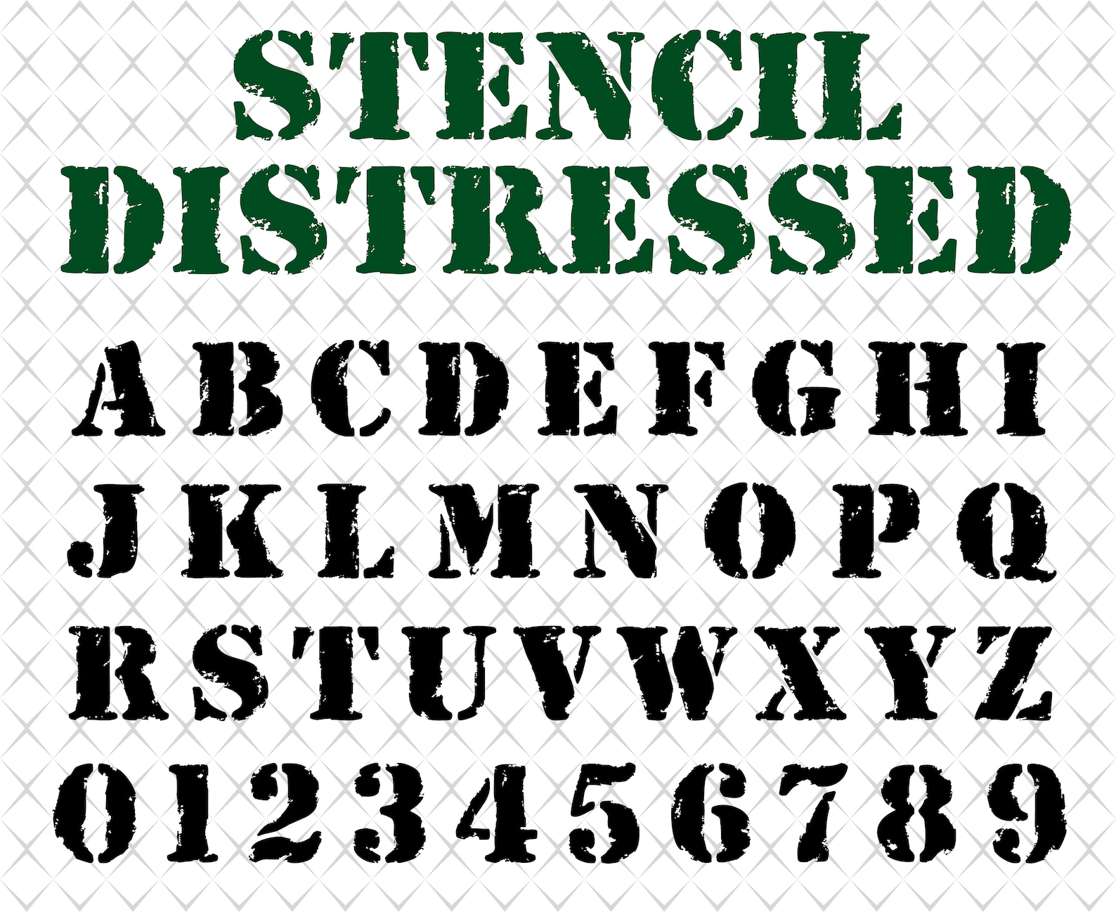
The only thing that could possibly make the block font cooler is going all the way with a spray can stencil block font.
https://i.etsystatic.com/21833494/r/il/ ... 6_ghm1.jpg
It's so blue collar it's correctional system, and kind of a Longest Yard vibe.
Also fitting considering the recent off field ventures of Steeler WRs.
https://i.etsystatic.com/21833494/r/il/ ... 6_ghm1.jpg
It's so blue collar it's correctional system, and kind of a Longest Yard vibe.
Also fitting considering the recent off field ventures of Steeler WRs.
The surest way to corrupt a youth is to instruct him to hold in higher esteem those who think alike than those who think differently.
Nietzsche
Nietzsche
-
Louis Lipps Service
- Posts: 3144
- Joined: Tue Sep 24, 2019 4:33 pm
Actually, this is the font that is used for the "Steelers" text in the logo (called "Gunplay"). I think it'd be cool to just follow that font through to the numbers:
-
Dan Smith--BYU
- Posts: 2146
- Joined: Mon Dec 09, 2019 12:33 am
Perfect. It has a blue collar look, like a stencil that would be used for painted signs inside a mill.
The surest way to corrupt a youth is to instruct him to hold in higher esteem those who think alike than those who think differently.
Nietzsche
Nietzsche

I'd be down with this in some form or fashion, and wow, I'm knocked down by the Chumbawumba reference.Louis Lipps Service wrote: ↑Mon Jun 24, 2024 7:30 pmActually, this is the font that is used for the "Steelers" text in the logo (called "Gunplay"). I think it'd be cool to just follow that font through to the numbers:
Nothing left to do but smile, smile, smile...
Get a life maybe?CoolShades wrote: ↑Sun Jun 23, 2024 9:44 pmOk, this is a very important topic and one that demands an answer! (Ok, not really… I’m just looking for something fun to discuss)
Why on earth are they sticking with this garbage font for their jersey numbers? They changed to this look in 1997. WTF? It’s pushing 3 decades now, and they STILL look like shit.
In my experience, (and I’ve asked this question countless times), almost everyone loves the block number uniforms. The current look either brings a negative comment or at the best, it brings indifference.
IMO, the block numbers are the ones that give almost every NFL uniform their cleanest, best look. The only teams that don’t have to have block numbers are the Bears, Cowboys and Colts (and the Cowboys and Colts have just a variation on the block). Other than that, most teams that try to find a unique font make their uniforms look like a car from NASCAR.
So what is the opinion here? If given the choice, would you keep the current number font or go back to the block numbers of the Noll era?
